How to Read Bluetooth Speaker Frequency Response Graphs
By Elena Petrovic • 19th Mar
Bluetooth speaker frequency response graphs dominate spec sheets and reviews, yet most buyers skip past them entirely, or worse, trust marketing departments to interpret them. Understanding what these graphs actually reveal about a speaker's real-world performance is essential, especially when placing a unit on a balcony, in a shower, or at a campsite where distance and environment demand honest measurement. Reading frequency response graphs requires learning the axes, recognizing manipulation tactics, and connecting lab curves to field conditions, where outdoors reveals the truth.
What a Frequency Response Graph Actually Shows
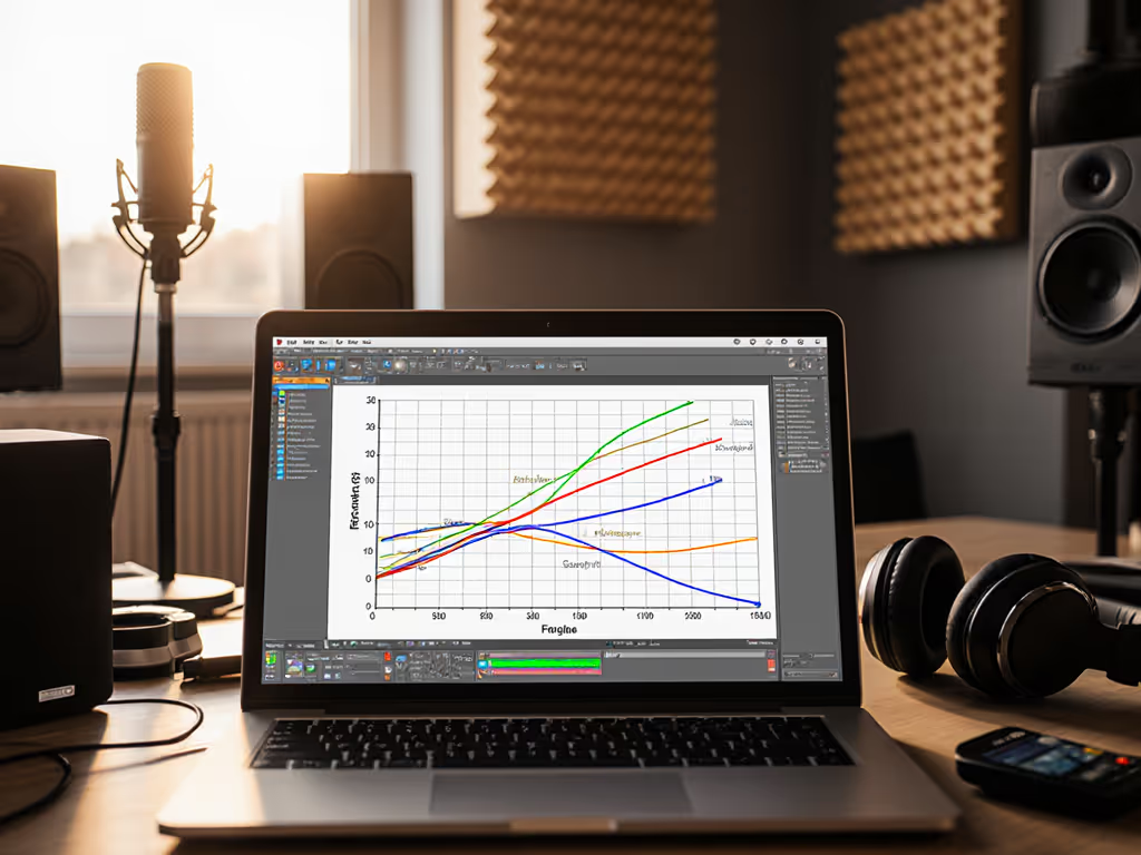
A frequency response graph is an XY plot that maps how a Bluetooth speaker reproduces sound across the audible spectrum[1]. The x-axis displays frequency in Hertz (Hz), ranging from low bass (around 20 Hz) to high treble (up to 20 kHz for human hearing, or 40 kHz for hi-resolution equipment). The y-axis shows sound pressure level in decibels (dB SPL), representing how loudly the speaker outputs each frequency[2].
The ideal response is a flat line, a speaker that plays every frequency at equal volume. In practice, every speaker exhibits variation due to design, materials, and tuning decisions[1]. A Bluetooth speaker intended for outdoor use might intentionally boost bass to overcome wind noise, while one designed for voice clarity in a bathroom might emphasize mid-frequencies where speech lives.
Thinking of a frequency response graph as a sound signature visualization helps. It shows you, at a glance, whether a speaker leans toward bass-heavy, neutral, or treble-forward character, and by how much[3].
The Frequency Spectrum: What Each Region Means
Breaking down the spectrum clarifies what different peaks and dips actually sound like: For a quick primer on driver roles, see our tweeter vs woofer guide.
-
Low frequencies (20-200 Hz): Bass and impact. Elevation here produces a powerful, boomy low-end. This is where subwoofers live. For outdoor use, slight bass lift can help cut through ambient noise and distance, but excessive boost at 1-5 meters can muddy clarity[3].
-
Mid frequencies (200 Hz-2 kHz): Vocals, presence, and clarity. This band carries speech, guitar, and the "character" of vocals. A dip here makes a speaker sound distant or hollow; elevation makes it forward and aggressive[3].
-
High frequencies (2 kHz-20 kHz): Treble, detail, and air. Presence peaks around 4 kHz (perceived brightness and "pop"), while extended treble adds shimmer but can sound harsh if overemphasized[3].
A speaker with a V-shaped curve (elevated bass and treble with recessed mids) typically suits EDM or hip-hop but will make podcasts and vocals sound unnatural. Understanding this map lets you predict whether a speaker will work for your content and environment[3].
The Critical Danger: Axis Manipulation
Frequency response graphs are easily misleading. The same speaker can look completely different depending on how the axes are scaled.
Y-Axis Stretching
Imagine two graphs of the identical speaker. The first graph plots SPL from 55 dB to 100 dB (a 45 dB range), while the second spans 45 dB to 115 dB (a 70 dB range)[2]. The first graph will look chaotic and full of peaks; the second appears almost flat. Nothing about the speaker changed, only the zoom level[2].
When more dB increments fit on the y-axis, each one physically occupies less vertical space, making the response appear smoother than it is. This is deliberate marketing psychology: a flatter-looking graph creates false confidence in neutrality[2].
X-Axis Restriction
A graph showing only 50 Hz to 500 Hz will emphasize bass detail while hiding treble behavior entirely. A full-range graph (20 Hz to 20 kHz) gives honest context. Always check the entire frequency range before comparing two graphs[2].
Smoothing and Measurement Artifacts
Lab measurements apply smoothing filters to reduce noise, but aggressive smoothing hides real peaks and dips. Two graphs of the same speaker with different smoothing settings can appear substantially different. Verify the smoothing methodology when comparing brands[2].
Translating Graphs to Real-World Performance
A graph measured in a recording studio at 1 meter under controlled conditions does not automatically predict how your Bluetooth speaker will perform on a balcony at 5-10 meters, in wind, or after hours of outdoor use with thermal stress. For how room materials and layout can reshape what you hear, read our room acoustics guide. Distance eats volume; measure twice before trusting marketing.
When evaluating a Bluetooth speaker's frequency response for your scenario, ask:
- Does the curve flatten around 2-5 kHz, or does it peak? A peak here adds perceived loudness and cuts through outdoor noise. Too aggressive, and it becomes fatiguing indoors.
- How much bass lift is present? Useful for distance outdoor use; problematic in enclosed bathrooms where bass resonates.
- What is the peak-to-dip difference? Calculate the highest peak minus the lowest dip across the range. A 15 dB difference suggests notable coloration; under 10 dB suggests more neutrality[2].
- Is the high-frequency extension smooth, or does it roll off sharply past 5 kHz? Sharp rolloff means less airiness and detail; extended treble supports clarity but risks harshness.
On a blustery balcony, I placed calibration markers at five and ten meters and let a playlist run. The loudest spec on paper clipped early as thermal throttling compressed output by hour three. Another speaker, modest on paper, held level until heat built, then gracefully reduced rather than distorted. That night confirmed: distance and time expose the real story. A flat graph at 1 meter tells you nothing about SPL at 5m, runtime-to-throttle timestamp, or whether wind condition affects midrange presence.
Lab vs. Field: A Comparative Reality Check
Lab Measurement (Typical)
- Conducted at 1 meter, indoors, in a treated room
- No ambient noise, wind, or thermal stress
- Single frequency response curve at moderate volume
- Snapshot condition only
Field-Relevant Testing
- SPL at 1m/5m/10m with calibration note
- Measured over time to detect runtime-to-throttle behavior
- Wind condition and temperature noted
- Placement height specified (ground-level bass reinforcement differs from waist-height)
- Output curve re-measured after sustained use to reveal throttling artifacts
Distance changes everything. A speaker graph at 1 meter is a starting point, not a guarantee. Outdoor or multi-room use demands field validation[1]. Some speakers use adaptive audio and room correction that changes the sound based on placement, which can make lab curves diverge from what you hear.
Common Graph Patterns for Bluetooth Speakers
| Graph Profile | Typical Use Case | Real-World Trade-Off |
|---|---|---|
| Flat/Neutral | Studio monitors, voice | May sound thin outdoors; lacks bass punch in noisy environments |
| Bass-boosted (rising below 200 Hz) | Portable outdoor/casual | Engaging indoors, muddy in small rooms, distance-friendly |
| Mid-forward (peak 500 Hz-2 kHz) | Vocals, podcasts, speech | Brilliant for voices, aggressive listening fatigue, weaker bass |
| Treble-lifted (peak 4 kHz) | Brightness, clarity perception | Feels louder at same SPL, harshness if over-applied, easier to cut through noise |
| V-shaped (elevated bass & treble, dipped mids) | Bass music, casual listening | Fun for genres, poor dialogue intelligibility, fatiguing long-term |
How to Evaluate a Frequency Response Graph in Practice
- Check the axis ranges first. If the y-axis is zoomed between 80 and 95 dB, the speaker is highly aggressive. If it's 20 to 100 dB, it's revealing a wider dynamic range.
- Note the smoothing. Graphs with 1/3 octave smoothing reveal broad trends; 1/12 octave shows detail and peaks. Understand which you're viewing.
- Compare the peak-to-dip difference. Smaller is generally better; larger indicates character, which may or may not suit your taste.
- Ask if it matches your scenario. A V-shaped graph is fun for music but poor for outdoor conference calls. A mid-forward curve excels with voice but may underwhelm with bass-heavy genres.
- Seek field measurements. Lab graphs are a starting point; real-world SPL data at 5m and 10m, plus thermal behavior over hours, are what actually matter on your balcony or campsite.
Summary and Final Verdict
Frequency response graphs are valuable, but only when read critically and contextualized against your actual use. The axes can deceive, smoothing can hide detail, and a perfect 1-meter curve in a studio tells you little about how a Bluetooth speaker performs across a patio, through walls, or over six hours at a gathering.
Empower yourself by learning the x-axis (frequency), the y-axis (loudness), and the common deceptions (axis scaling, incomplete ranges, aggressive smoothing). Compare graphs honestly: same scales, same smoothing, same frequency range. And crucially, seek field data (SPL measurements at distance, runtime monitoring, and thermal throttling notes), because marketing blurs the truth. Outdoors reveals it.
When you understand frequency response, you stop being fooled by spec sheets and start predicting how a speaker will actually perform in your kitchen, shower, or backyard. That clarity transforms buying from guesswork into confidence.
Related Articles